Signal Duration
In this one-week course on Information Design, we were challenged to visualize a personal communication behavior in an instantly understandable graphic.
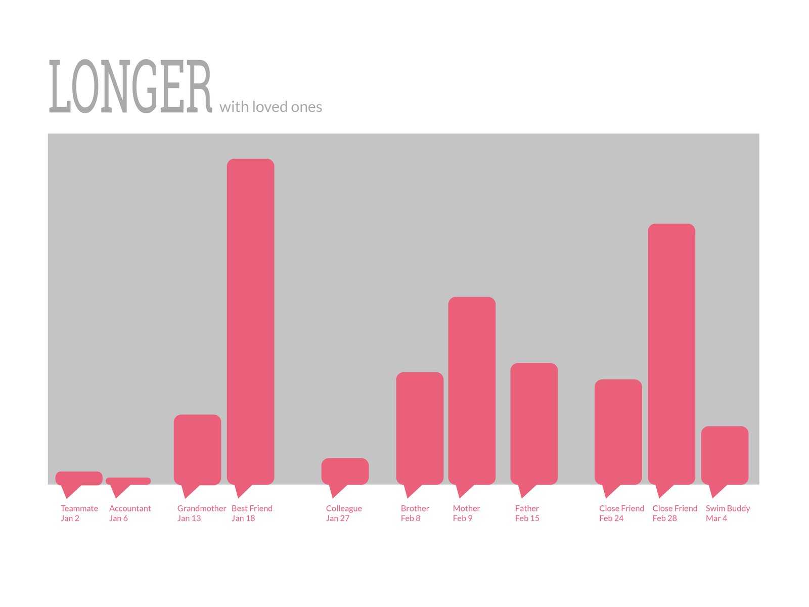
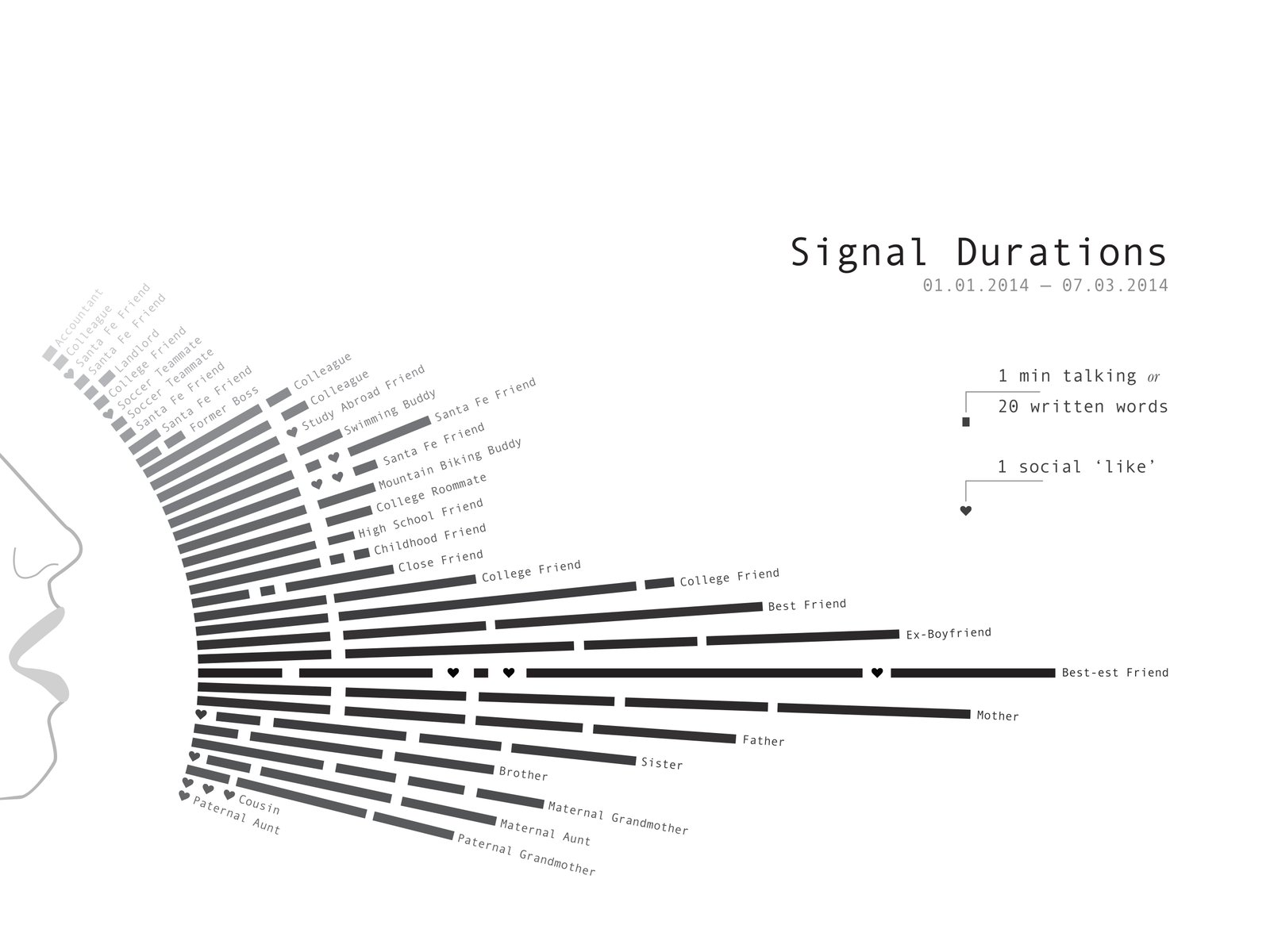
After analyzing 150 phone, email, and Skype conversations, I chose to communicate that I have more lengthy conversation with my closest friends and family. I pursued two different ways of visualizing this behavior.
Longer With Loved Ones uses a bar chart style to highlight the difference in length between conversations. I stripped away many details to show only the abstracted length of a small sample of conversations, the date, and the relation of the other person. The resulting infographic is clear, but a little sterile.
Signal Duration was a later attempt to communicate the same data, but in a more symbolic manner. It builds off the theme of telegraphs to illustrate that, in this era of IM and text messaging, I have more "old fashioned" patterns of communication. Even though Signal Duration contains more information–including a larger sample of conversations, a legend, dates, and a mouth graphic–I think it does a better job of emotionally connecting with the viewer and is more visually interesting.